


2019 Art Decor Trends That Will Brighten Up Your Home
ByGrace Ignacia SeeImage courtesy of Lifestyle Asia
With decor trends changing every season, it might be challenging to stay up to date. To help you identify what to try this year, The Artling brings you the biggest home decor trends for 2019. We looked at some of our favorite themes and materials that will brighten up your home, whichever hues they may compliment. Whether you’re looking to add some eclecticism, some texture, or even experiment with this year’s Pantone color of the year, here are some art and design items that are sure to make your interiors stand out:
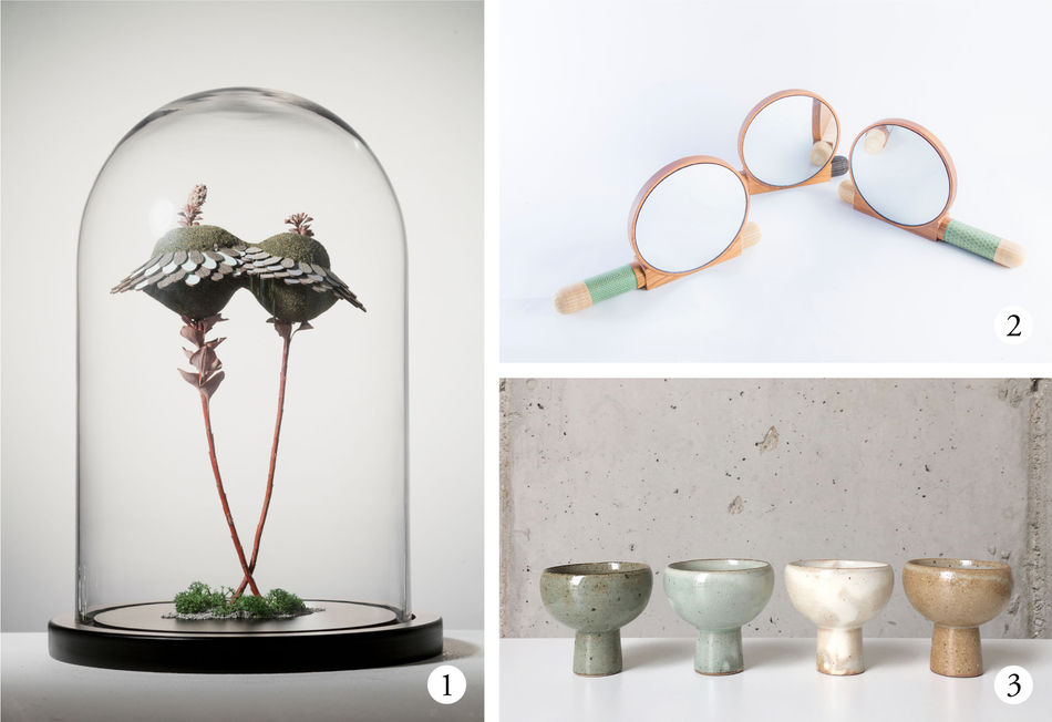
A dash of biophilia
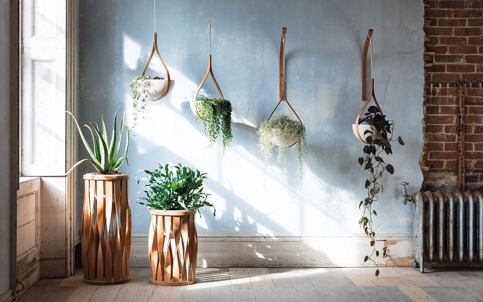
Image courtesy of Tom Raffield
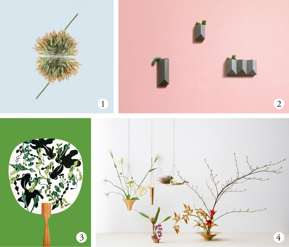
- Death of Beauties By Yuyang Liu
- Wall plant pot By Bentu Design
- Midsummer Night's Goldfish By kuanth
- Spin Ikebana Vase By Takenouchi Webb
With the surge of masses more in tune with themes of sustainability comes the greater interest in biophilia. The definition of biophilia is the affinity that human beings have with the natural world - we as humans are drawn to the innate tendency of seeking stronger connections with nature. This then translates into the calm green hues that we’re attracted to and strive to be around. What better way to kick back from your fast-paced, technologically advanced society than to surround yourself with lush nature-inspired artworks? These artworks and designs are made with nature as its foremost inspiration, bringing organic themes to any room.
Inject some eclecticism
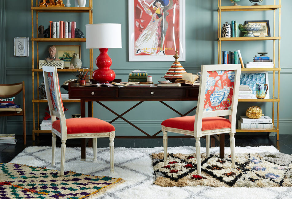
Image courtesy of Nandina Home & Design
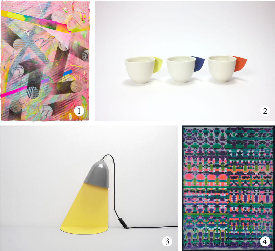
- untitled By Hiroshi Takeda
- Glimpse espresso By Atsushi Kitahara
- Light shelf / Space Grey By Ilsangisang / Jong-Su Kim
- ec2 By KWIT
Whilst it’s safe to stick to neutral tones, an eclectic statement piece here and there has the power to balance out stark whites and neutrals and add a little more character to any room. Balance is the active term here, so do not go on a quirky steroid spree of 20 different mismatched furniture pieces, rugs, and artworks and throw your space into an overdose of color. Stick to one or two vivid colors across a couple of works, allowing your eyes to be drawn to the creative symbiosis they bring to your room.
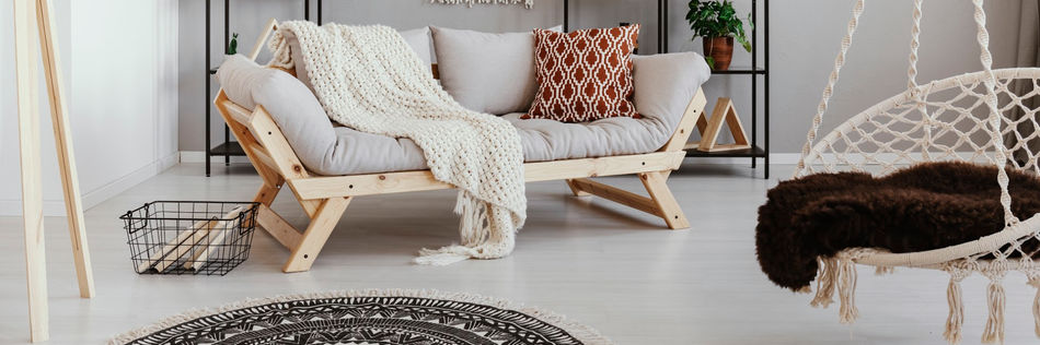
Some feel, some texture
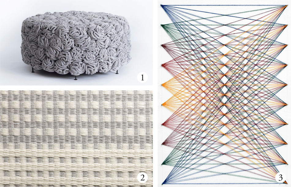
- Handmade Crochet Elements Pouf By Iota
- Snow Grid By Tiffany Loy for The Rug Maker
- Nailed it Series No. 82 By Sumit Mehndiratta
If adding bright, eclectic works aren’t your cup of tea, perhaps try adding some texture instead. Textured works have the capacity to bring depth and class to a room that might be playing it a little safe. Texture is one of the most important elements of a beautiful room. A lack of texture makes a space feel cold and sterile, whilst a room with too much texture creates too much of a busy and sometimes even dirty atmosphere. When balanced appropriately, perhaps with a rug or a textured piece of furniture, your room could come alive with personality.
Angles and edges
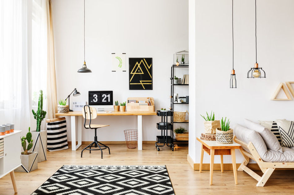
Image courtesy of Meghan LA
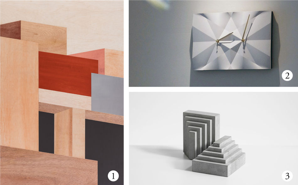
- Structure-Shelf By Jae Won Choi
- HOMER CONCEPT | Diamond Origami Clock - white By Elvis, Hsiu Ming Chang
- Bookend By Bentu Design
Distributing curved lines with hard edges could give your room an incredibly polished look. The inclusion of geometric works to a ‘quiet’ room instantly adds visual interest. Patterns are the immediate go to as they meet all of an interior’s basic requirements whilst looking modern. If you’re not sure where to begin, think about color and size. Choose an artwork or design item that fits your color scheme so as to build a relationship with it to the rest of the room. Then make sure that its size does not overwhelm the overall space of the room. Above all, make sure you choose a piece that you love and is aligned to your personal taste.
Earthy tones
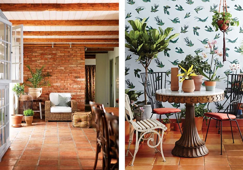
Image courtesy of Sydney Design School
Working with sandy, terracotta hues is a way of amping up boring neutrals. It gives the impression of a more relaxed way of life, perhaps that of a getaway within Venetian or Spanish architectures, with its old world style and warm atmosphere. The addition of these organic, earthy tones creates a more rustic feel to any home. Whilst the immediate thought when including terracotta in a home would be to include them in your tiles, they, in fact, work just as well on walls and tableware. Terracotta is easy to integrate into any space and adds a sophisticated flare. This earthy palette can also be complemented easily with an array of greens and lush foliage.
Terrazzo blends

Image courtesy of Joyce Wang Studio
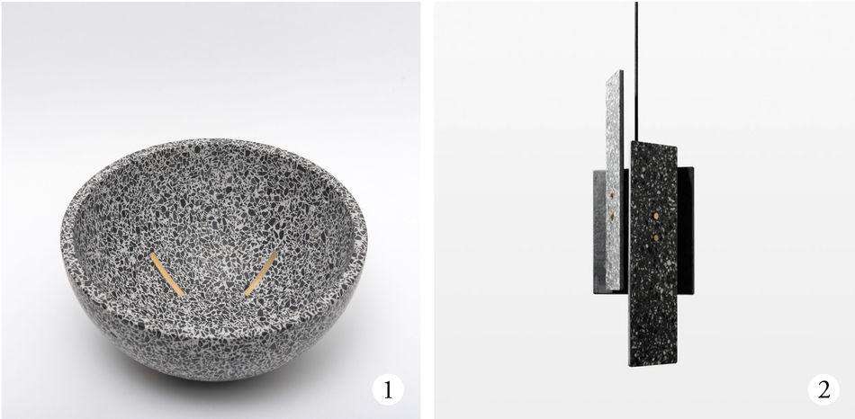
Terrazzo is a material that consists of chips of marble, quartz, granite, and glass, bound together before it is used from anything from flooring to the design items below. Because of its composite nature, it can be produced to be relatively plain to intricately detailed. Designer Joyce Wang has used terrazzo in her projects right from the start of her design studio. She loves it for the “exceptional qualities” it has given her works, and how it reveals an archaeology where other materials might remain placed when viewed from different distances. They give already beautiful works a sculptural form, allowing any room a sense of luxury. Due to its versatile and stunning nature, we see terrazzo as a material that will remain on trending interior decor lists for a long time to come.
Pantone perfection
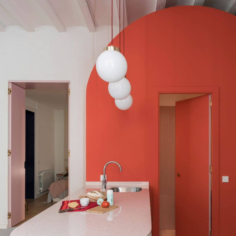
Image courtesy of Colombo and Serboli Architecture
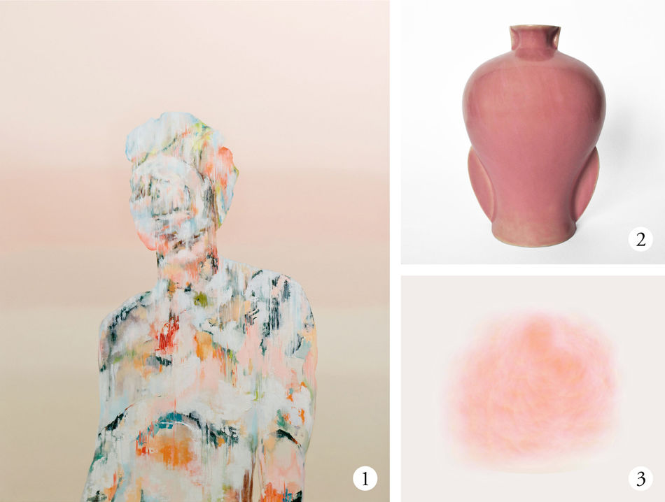
- Through Thick and Thin 2 (Dawn) By Simon Ng
- Split Vase - Rose By LIM + LU
- opinion of the moon By Surat Tomornsak
The Pantone color of the year 2019 is Living Coral. Its gender neutral nature and refreshing nature allows it to work seamlessly with anything from bathrooms to children’s rooms. This vibrant hue was chosen for its “animating and life-affirming” hue which “energizes and enlivens with a softer edge”, according to the official Pantone website. Living Coral urges us to respect and preserve nature and its natural resources, highlighting critical issues with climate change and environmental threats.
Tying this into how we can include living coral into our home decor, we realise how versatile it is, allowing it to fit easily into any home. It resides on a similar hue spectrum to terracotta tones, can be added into any room in the form of an eclectic statement piece, and works effortlessly together with a range of organic greenery.
To see more artworks on The Artling, click here.
To see more design items on The Artling, click here.
Any views or opinions in the post are solely those of the authors and do not necessarily represent the views of the company or contributors.

